The choice of layout, the arrangement of photos, the selection of suitable fonts and the effect of colours are decisive factors for a successful photo card design. In this article, we look at these aspects and offer practical tips for designing appealing photo cards. With these creative tips, you can create your own unique photo card with personalised photos and text.
1. Layout
If you want to do it quickly, choose a template with a layout that you like. Of course, you can always customise the layout to suit your own ideas. Or you can start with the «Design yourself» template and place text, photos and graphic elements as you wish.

You can either opt for a template with a layout or choose «Design yourself»
We recommend that you first consider the number of photos you want. Should one photo be displayed large or should a collage be created with several photos? First import the desired photos and drag the photos onto the drawing area (Add to page).
If photo placeholders have already been placed in a template, the photos are placed in the placeholders in the order in which they are sorted using «Autofill». To only see the photos that have not yet been placed, the «Hide used» option can be selected on the right.

The number of desired photos must be taken into account in the layout
Every change can be undone with a key combination (Windows: Control+Z, Mac: Command+Z) or with the left arrow at the top left or restored with the right arrow.

Every change can be undone or restored
An object can be moved on the drawing area by clicking and dragging. If the object is selected, the object can be freely rotated at the corners slightly outside the points. The size of the photo placeholder can then be adjusted at the points on the frame of the placeholder. If the Shift key is pressed and held while changing the size, the photo placeholder is scaled proportionally.

Photo placeholders can be freely rotated and resized
If the proportions change (e.g. from portrait to landscape format), the position of the photo can be changed by moving the arrow in the centre of the placeholder. The size of the photo in the placeholder can be adjusted using the magnifying glass symbols (+/-). The original proportions of the photo placeholder are restored with «Fit the image within the photo slot».

Photos in the placeholder can be moved, enlarged or reduced in size
The photos can overlap. With «Change layer order», the order of the elements on the layers can be adjusted from front to back. If the placeholders for the photos have been placed but a different photo is required, the placeholder does not need to be deleted. Simply drag a new photo into the placeholder or use «Swap photo» to swap the photo with another photo from a placeholder. Use the percentage and the symbols (+/-) next to it to change the transparency of the photo.

The order and transparency of the placeholders can be changed
2. Fonts
The choice of font has an influence on how a message is perceived. The font can evoke or influence emotions and reactions in the recipient. In the presentation of words, a font can have the same influence as the volume or emphasis of the spoken tone. For example, the choice of font can reinforce the message and emphasise the emotions of the photos or, with a contrast, increase the tension and evoke other reactions.
• Fonts with serifs
Serif fonts are serious, formal, traditional and, above all, very easy to read. Both for titles or short texts in a large font size, as well as for longer texts. Garamond is one of the fonts that has been used since the 16th century and is still the most frequently used font in book printing today due to its excellent reading properties.

• Sans serif fonts
Modern, dynamic, elegant and very easy to read even in small display sizes. In a slender version, sans serif fonts appear very elegant and precise; in bold type they tend to be robust and strong. Open Sans is a popular font with a large number of variants and a large repertoire of characters. This is another reason why this font is very popular for use on websites and in desktop apps.

• Handwriting fonts
Personal, delicate, decorative and with a personal, handwritten character. Cursive fonts impress with their creativity and are suitable for headlines and as large decorative letters with graphic originality. Longer texts are not easy to read in this font. Cursive fonts are used worldwide and have been in use for a long time in many variations.

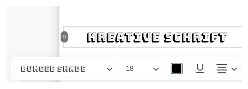
• Creative fonts
Unusual fonts such as stencil fonts, technical fonts or fonts with graphic elements such as pixels or drop shadows are highly creative and very expressive. They should be used sparingly and in a large font size. This font with drop shadows can only display text in capital letters.
3. Colours
Every colour triggers certain reactions. Colours have an influence on our behaviour and mood, on how we perceive something and what meaning it has for us. Symbolic meanings can be different in certain countries and cultures, and the unconscious effect of colours on people is used specifically in marketing and design.
Here are some positive meanings of colours that can be used specifically to convey the mood of a message:
- Green: natural, lively, fresh, hopeful, relaxing, harmonious
- Red: strong, passionate, courageous, dynamic, active, warm, vital
- Pink: tender, feminine, innocent
- Blue: cooling, refreshing, calming, safe, stable
- Yellow: happy, cheerful, intelligent, light, bright, optimistic
- Orange: friendly, fun-loving, enjoyable, inspiring, attractive, uplifting
- White: pure, clear, innocent, light, neutral
- Black: calm, deep, fascinating, serious, elegant, classic, modern, functional
- Purple: peaceful, wise, spiritual, frugal, sad, magical, creative
- Grey: neutral, reserved, businesslike, elegant, professional, formal
- Brown: natural, secure, protective, stable, reliable, traditional
The choice of background colour has a major influence on the effect of photos and, in combination with the font colour, on contrast and legibility. Simply double-click on the background and select the desired colour for the background. Click on «Done» to return to the standard view.

Colours have a big influence on the effect of photos
For a uniform colour effect, the colour of elements can be adapted to the colours in photos. If you select a text and change the colour, you can use the pipette to select a colour from a photo.
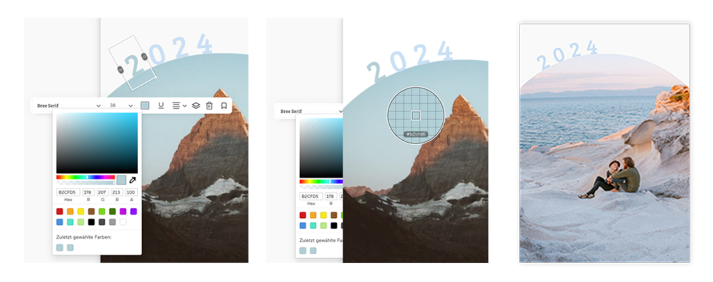
The colour of elements can be adapted to the colours in photos
We wish you lots of fun and success with the creative design of personalised photo cards with your own photos!
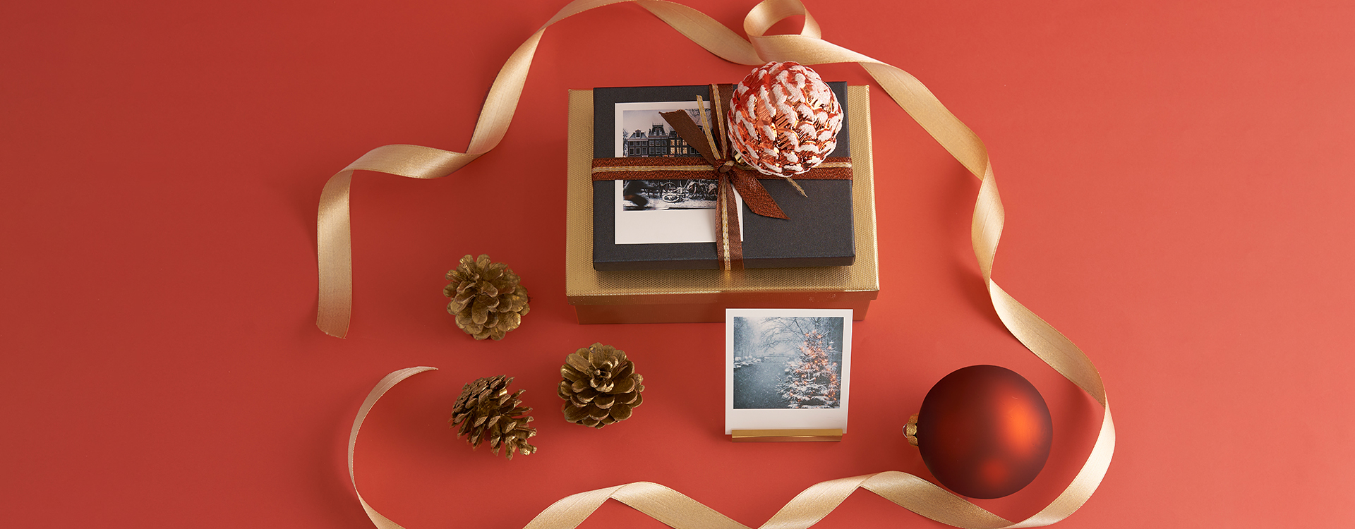
Photo card in various formats with customisable front and back
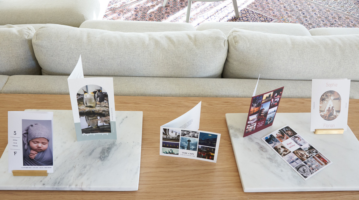
Folded photo card in various sizes with customisable front, back and inside pages