
After the duty, the pleasure; after the planning, the design. In this second part of his article for the trade magazine Publisher (06/2018), photographer, designer and journalist Ralf Turtschi explains how to design the ‘perfect’ photo book. You can download the full article – which contains many exciting design options – as a PDF at the bottom of the page.
The most important tips in summary:
Design similar things in a similar way
This rule is as simple as it is important: if you design the book pages in the same style, keep fonts and font sizes the same, etc., you will save yourself work and the end result will generally look better.
Always think in terms of double pages
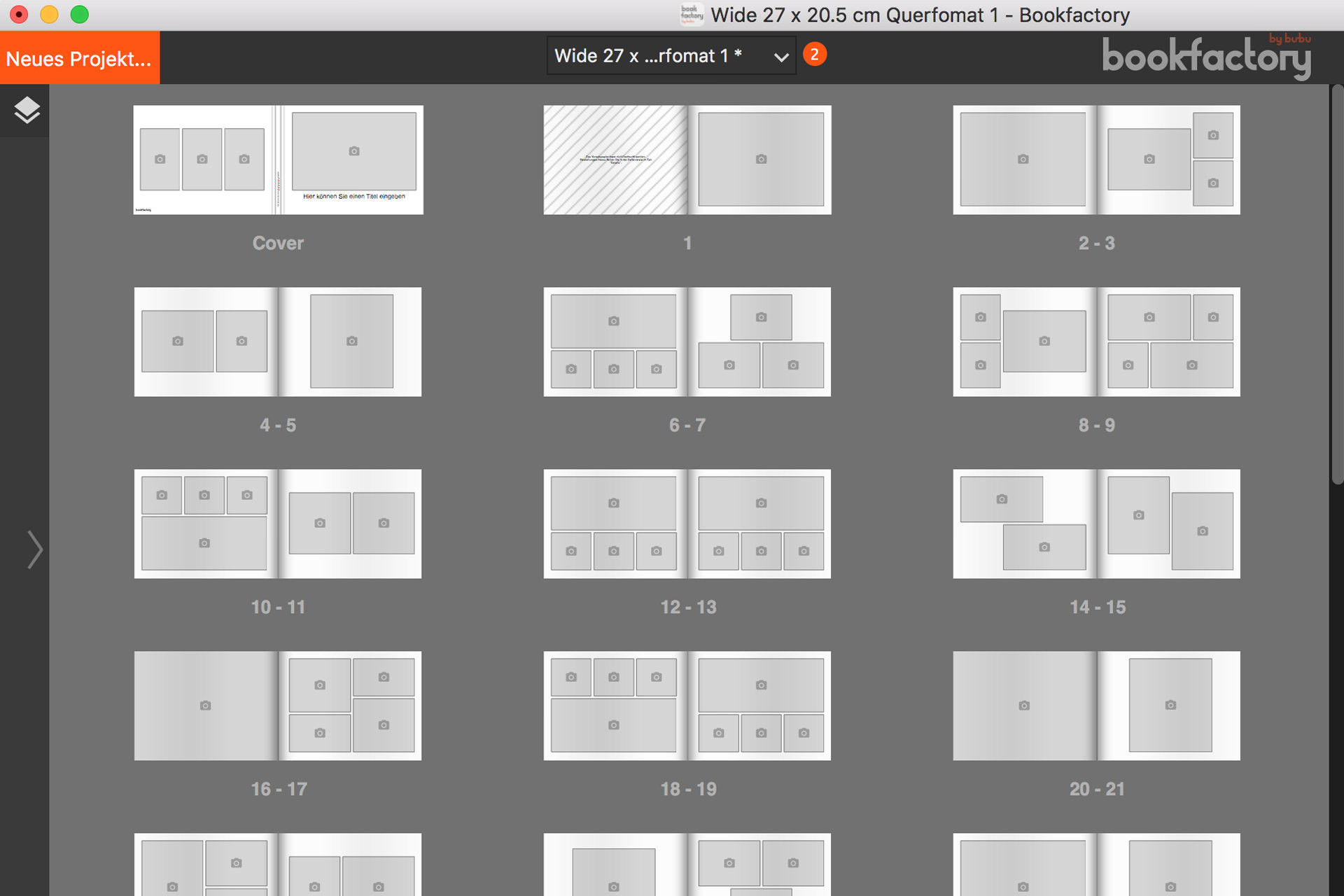
Whether you place one photo across both pages or spread many small ones across them, the double page is the unit of measurement for photo book design. With the Bookfactory softwareit is quite easy to design a double page as a template for the whole book. We explain how to do this in the blog post ‘Designing a photo yearbook with family photos’.
White space is important
Let your pictures do their work by giving them enough space: ‘Good pictures need air to breathe,’ recommends Ralph Turtschi, because ‘a single picture on a double page is like a solitary wood: you look at it.’
Use texts consciously
It doesn’t have to be prose, but consciously placed image descriptions can help to give the images more meaning. They are also a simple design tool that can be used to make the photo book more varied.