Discover how award-winning designer Hanns Schmid uses PDF-to-Book to create unique books. Find out which papers, bindings and design principles he uses – and how you can perfectly realise your own book!
A good design deserves high-quality realisation. Our online PDF-to-Book service is the perfect solution for anyone who wants to print individual books in runs of 1 or more.
Whether it’s an art book, portfolio, photo book or dissertation: you supply a print-ready PDF and we’ll take care of the rest! Choose from a variety of formats, papers, bindings and finishes to design your book exactly as you want it. Thanks to the latest printing technology and our many years of experience, we produce high-quality, long-lasting books that perfectly showcase your design.
The example of Hanns Schmid shows that PDF-to-Book is not only ideal for private projects, but also for award-winning design work. Hanns Schmid, born in Switzerland in 1958, is a graphic designer, photographer, filmmaker and publisher. After graduating from the HFG in Basel (FHNW) in 1992, he founded the agency Hanns Schmid Grafik Design in 1995. He has received multiple international awards for his work. In the interview, he talks about what is important in book design and how he uses PDF-to-Book.
How long have you been designing books with PDF-to-Book and how did you find out about PDF-to-Book?
I have been designing my books with PDF-to-Book since 2010, but my passion for books and design goes back much further.
After working for the Swiss Bank Corporation, I founded my own publishing house, Edition Schmid, which I renamed Hanns Schmid Publishers in 2002. Since then, I have published numerous art and design-oriented books that have received multiple awards, including the German Design Award and the German Brand Award. It has always been particularly important to me to develop visual concepts that combine aesthetics and content.
I became aware of PDF-to-Book when I heard about the good quality and wide range of products. As early as 2010, PDF-to-Book offered the possibility of printing single runs – exactly what I was looking for for my high-quality book projects!
The digital print quality of PDF-to-Book convinced me very quickly. In digital printing, each page is treated individually, which means that the ink is applied per page, unlike offset printing, where standardised ink is used across the entire book. This makes digital printing particularly advantageous for my short print runs, as it is more efficient and flexible.
You have won design awards for books such as Modena Paintings and Fauvism. What do you show in these works?
Both books are about art:
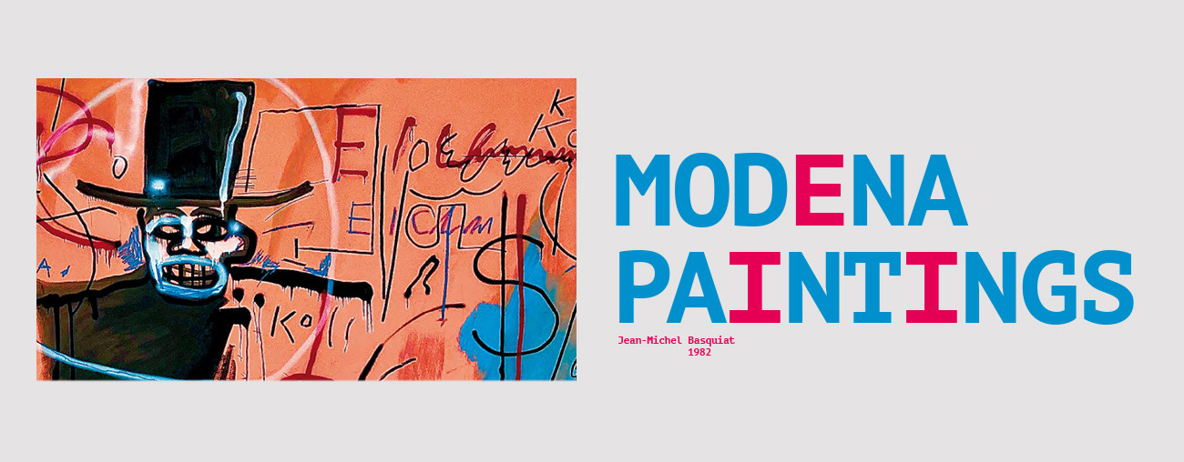
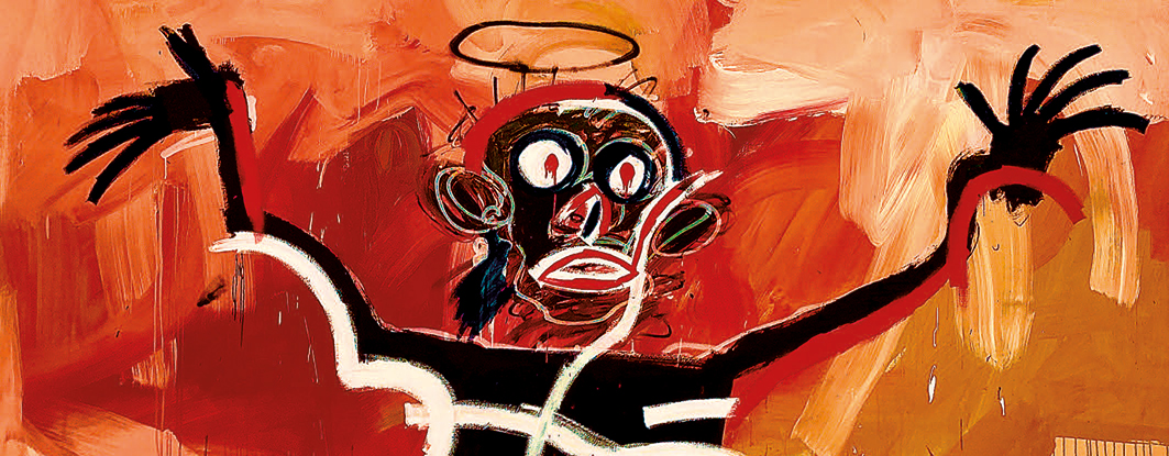
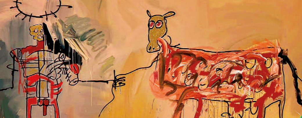
Modena Paintings: Jean-Michel Basquiat’s Modena Paintings are a series of eight large-format works that he created in the summer of 1982 in Modena, Italy. These artworks show his characteristic expressive visual language, which reflects social and cultural themes.
Jean-Michel Basquiat was a passionate and rebellious artist who combined graffiti, painting and social criticism such as racism, power structures and consumer society. His rapid fame brought him success, but also pressure and inner struggles with drugs and identity.
Fauvism: Fauvism is an artistic movement that emerged at the beginning of the 20th century and is known for its expressive use of colour. The artists used bold, unnatural colours to convey emotions and impressions instead of realistic representations. This movement lasted only a few years, from about 1904 to 1908, but had a significant influence on modern art. Fauvism paved the way for other avant-garde movements, such as expressionism and cubism.
I adapt the design of the book to the subject. The book about Fauvism, for example, is very colourful. Each chapter in this book is a different colour.
At PDF-to-Book, you can choose from a variety of formats, paper types and binding techniques. Which of these options did you choose for your award-winning books and why?
My choice of format and paper depends heavily on the project. For the book ‘Modena Paintings’, for example, I chose Magno Satin paper because it reproduces the colours and details of the art particularly well. In addition, the paper’s grammage is important to me. I like thick paper, so I opted for 200 g/m². This paper makes the book robust and gives it a good feel. For the binding, I chose a durable and elegant adhesive binding.
My favourite formats are Carré and Jumbo.
Here you will find the PDF-to-Book range.
Which design principles are particularly important to you and how can they be seen in your books?
I follow the principles of ‘form follows function’ and ‘reduce to the max’.
Form follows function means that the shape of a product or object always serves the function that it is designed to fulfil. The aesthetic features are therefore directly influenced by the practical application and the user experience. The shape is not the result of purely artistic considerations, but of the desire to make the product functional and user-friendly.
A good example of this is the shape of a wine glass, which has been specially designed to get the best out of wine. The narrow opening ensures that the aromas of the wine are concentrated and released directly into the nose when drinking, enhancing the taste experience. The long stem prevents the hand from touching the cup and warming the wine with body heat. The bowl-like shape of the glass allows the wine to unfold and the aromas to develop better because the wine can ‘breathe’ in the wider surface of the glass.
The shape of the glass thus follows the function of bringing out the best in the wine and providing a good drinking experience.
‘Reduce to the max’ is a design principle that focuses on the art of reduction and requires the courage to consciously use white space. It’s about showing only the essential elements and leaving out everything unnecessary. This reduction creates a clear and focused design that draws attention to the essentials.
What advice do you have for young graphic designers who want to experiment with book design?
Practice makes perfect and a love of books is a must. If you don’t love books, don’t even start! Because enjoying the design process is the key to success.
I have been most inspired and influenced in my work by Emil Ruder, a Swiss typographer, author and teacher, and Armin Hofmann, a Swiss graphic designer and influential art teacher.
Find out more about Hanns Schmid:
Hanns Schmid (Grafiker) – Wikipedia
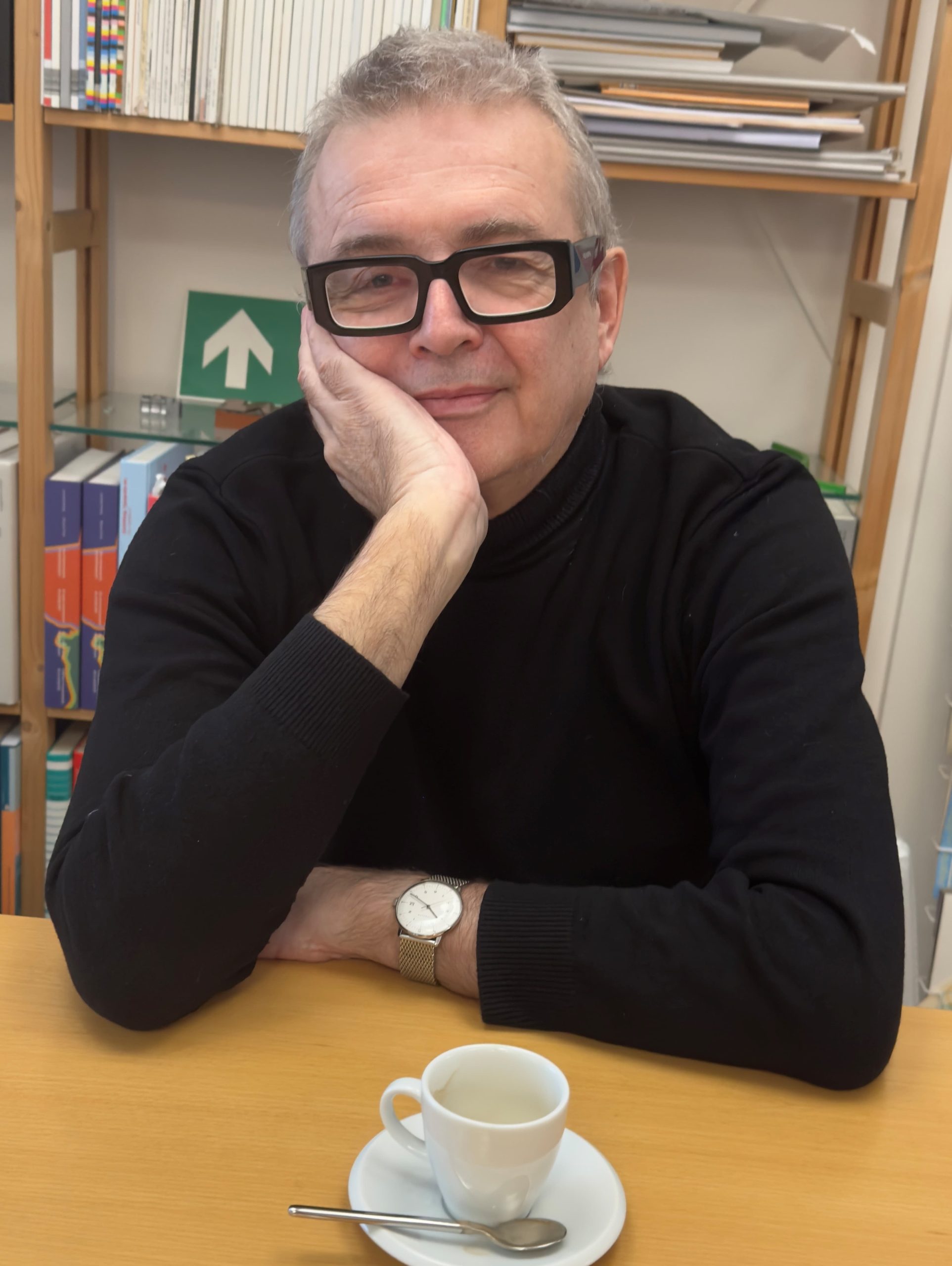
Hanns Schmid

