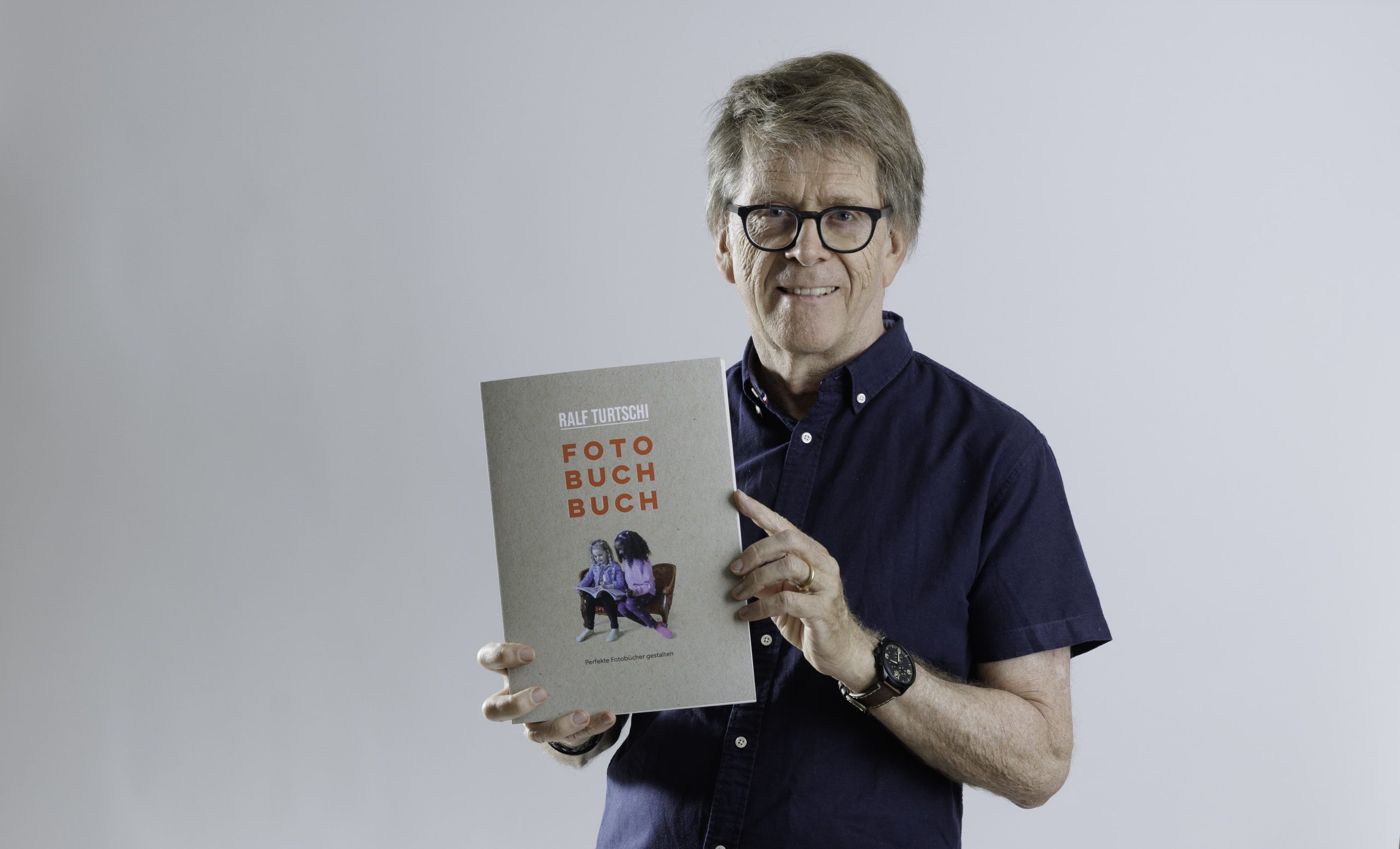
Good news for everyone who wants to create beautiful photo books: Ralf Turtschi gives professional tips on all aspects of design in his new “Photo Book”. He shows how it’s done with numerous tricks from the pros. On this occasion, we of course did not miss the opportunity to ask him some questions about his latest work and share them with our readers.
After your book “Fotografie für dich” (Photography for you), which was published in spring, you are already putting out a new work – this time on the subject of photo book design – what drives you?
I created my first photo book with bookfactory’s software in 2005. Soon after, I wrote the brochure “Designing Photo Books”, which has reached three editions so far. I have now decided to turn it into a comprehensive book – in this respect, the topic is not new to me as a typographer and photographer. Good pictures deserve to outlast the next generation of computers as high-quality products. I myself have produced over a hundred photo books, which I look at every now and then. The pictures on DVD or on the computer, on the other hand, slumber quietly away. With the photo book I want to share my experience with photo book portals and help to create photo books with wow effect. A source of inspiration that does not yet exist.
Why is there a need for a book about photo book design? Isn’t everything clear with the simple platform operation?
Not at all! I’ve been teaching and writing about photo books for many years, so I can see where the fly is. It’s not as if everyone who takes good photos also knows something about layout, text, printing, paper, binding and design. I compare photographers to soloists who have mastered their instruments. But anyone who produces a great photo book has to combine different skills like a conductor: Suddenly, the focus is no longer on the individual image, but on the composition on a double page (with a fret in between). On the double page, several images work together, interfering or complementing each other. A portrait format is not the same as a landscape or square format. Printing on different papers each looks a little different, and binding techniques want to be considered. Then there are texts like titles or captions to integrate, backgrounds or other. And how to format texts, which fonts fit and how large to make them, all this is not in the platform software. The photo book contains all the important design parameters that make it possible to create a perfect photo book. You don’t need to be a design genius to do this.

The photo book is clearly illustrated and shows the various production options.
Is there any rule at all for designing beautiful photo books?
Book design is not a new discipline. And beautiful books are awarded prizes every year. The same design principles apply to photo books as to other print products. One of them I can’t stress enough: less is more. On average, I recommend no more than three images per two-page spread. For a book of 60 pages, this results in an image selection of 90 photos. All kinds of “frippery” should also be used sparingly. Frames, shading, or clip art elements often interfere with the photos. I show all the applications in the photo book – what works and what does not.

18 layout tips for dummies show what works and what doesn’t.
What can readers expect from the photo book?
In it, I’ve addressed all the aspects that are important in the design and production of photo books. The Photobook Book is written in a manufacturer-independent way, because good design is not dependent on a particular platform. I address myself with it to picture makers, who attach importance to the fact that responding photos are presented also accordingly in a book. If photo books look like the photo-pinned refrigerator, then any photographic aspiration is extinguished. If you use the photo book as a working tool again and again, you will achieve better results. Dozens of tips and layout examples show how a professional produces photo books.

Practical examples of use with measurements show the structure and application.
How important do you think the outer form, the paper and the binding are?
Haptics are important again in the digital age. Looking at photos on a tiny cell phone, wiping them away in seconds and moving on to the next one has nothing to do with photographic contemplation. Holding paper in your hands, leafing through it slowly, and enjoying great photos in brilliant sharpness up to A3 format is incomparable. I appreciate to use different papers, whether natural paper, coated white paper or a chemical photo paper exposure. Chosen to fit the theme, the result is still something completely different than on a cell phone. Of course, as a typographer, I am a fan of a perfect binding. Especially at bookfactory you will find a huge selection of book sizes in different papers and paper thicknesses, made with perfect binding and hardcover, softcover with thread stitching, wire stitching or wire-o binding. Now even a small format 14 × 14 cm with rounded corners is possible, it’s called Flex.
Which errors do you see most often?
It’s usually an accumulation of amateurish image comprehension that gives a less than favorable overall picture. First and foremost, of course, it is the good photos that speak for themselves. In the photo book, the RGB color space of the camera is converted into the CMYK color space of the print. In the process, some colors fall by the wayside. Lush green meadows are often rendered too dark or dull. I will try to make you understand what happens in printing in a second technical chapter. There is a clear description of what happens in printing or photo paper exposure and why it is better not to compare the screen with printing or photo paper exposure.
Typographically, texts are often written across the entire page width, just like in Word. In a font that is too large, it looks like a children’s book. Reading texts should be written in sizes 9, 10 or 11 point. Bulk texts look more professional if they are divided into two or three columns.
You are a fan of structure and order – why no chaos in the photo book?
Designing always means creating order. Chaos arises by itself and does not need to be learned! Implemented in the layout, this means: different image sizes, proportions, positioning, colors, image types, frames, texts, etc. In my view, I show how design principles work and how to skillfully vary order-chaos on the design axis. Here, too, the rule is usually: less is more.

Many tips around cover design with text and photo.
In books, newspapers or magazines, there is always talk of type area. What do you mean by this?
A type area is a basic structure according to which recurring elements can be aligned in the same way. For example, the page margins, which should be the same on each left and right page. Bookfactory is based on a professional design grid, which divides the pages arbitrarily into grid cells that allow fast and uniform positioning. I myself developed this grid cell system for Bookfactory in the early days, it works much more efficiently than the usual box systems.

You chose the Swiss brochure with open thread stitching as the binding. Why?
The book is really a textbook for reference, to get all kinds of ideas, to write in, to make notes. The natural paper Lessebo is easy to write on, so the Swiss booklet with open thread stitching is an invitation to intensive learning use.

In the Swiss brochure with open thread stitching you can see the thread stitching.
Lastly, five important tips for photo book design?
1. planning is very important. On the paper once the photo series and the content structure determine.
2. determine the size of the book and the choice of material. Do not hesitate with this for a long time, because a good photo book does not depend on the size. You can try the next photo book in a different format.
3.a photo book is not a picture archive in printed form. Show only really good photos. A few outstanding photos in the middle of average pictures will turn the product into an 08/15 book.
4. also pay attention to sameness. If image type, margins (top, left, right and bottom separately), image sizes, text sizes, positioning can be unified, do it.
5. do not be afraid to make mistakes. Everyone makes mistakes! Expertise and mastery only come from allowing mistakes. Reflecting on your own mistakes to learn from them applies in photography but also in photo book design.
We thank you for the interview – good luck with your book!

Ralf Turtschi; Fotobuchbuch – Perfekte Fotobücher gestalten; 144 pages, 21 × 29.7 cm, Swiss brochure with open thread stitching, with numerous examples and illustrations; price Fr. 35.- (excl. shipping/packaging); self-published. ISBN 978-3-033-09236-5.
Information and orders via the webshop directly from the publisher:turtschi.medienwerkstatt-ag.ch or in bookstores.